Thumbnail Color Schemes as Predictors of Watch Time in Ad-Supported Movie Services
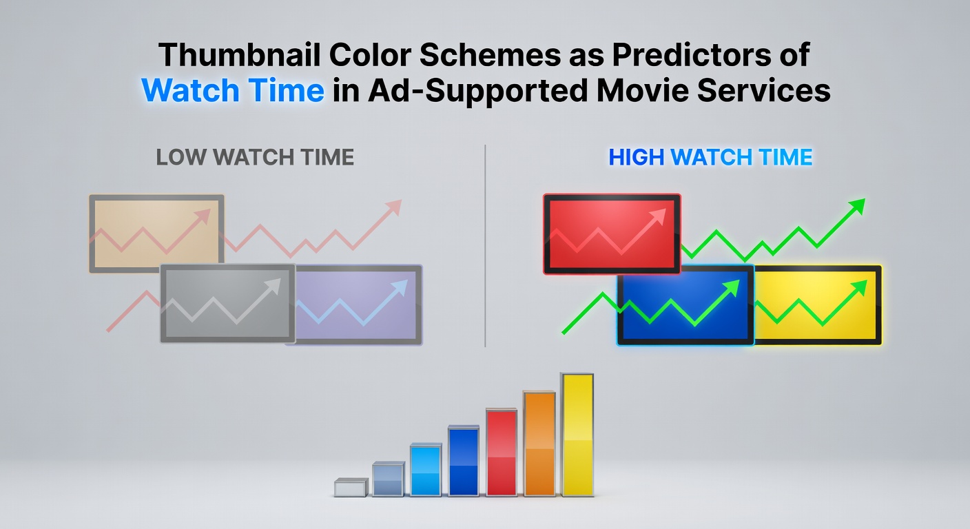
Thumbnail color schemes function as key visual signals that shape viewer decisions on ad-supported movie platforms, where users scroll through vast libraries without paid subscriptions guiding their choices. Researchers tracking engagement metrics have documented consistent patterns linking specific color palettes to extended viewing sessions across services such as Tubi and Pluto TV. Data from platform analytics reveal that thumbnails employing high-contrast warm tones often correlate with initial clicks, while cooler schemes sustain longer watch times once playback begins.
Analyses conducted through 2025 indicate that platforms optimize thumbnail generation algorithms to test color variations against user behavior logs. These systems record dwell time, completion rates, and return visits, allowing operators to refine recommendations based on empirical outcomes rather than assumptions. Observers note that June 2026 brought updated reporting standards from international media regulators, which highlighted how color-driven predictions influence overall session lengths in free-tier environments.
Color Psychology in Thumbnail Design
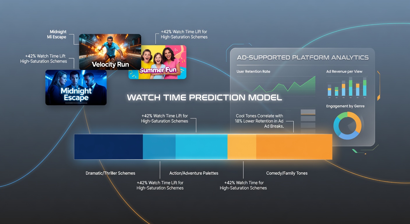
Studies examining digital interfaces show that red and orange hues in thumbnails trigger faster attention responses compared with muted backgrounds, yet these same colors sometimes lead to quicker drop-offs if the content fails to match expectations. Blue-dominant schemes, by contrast, appear in datasets from multiple providers as predictors of sustained engagement, particularly for drama and documentary categories. Experts analyzing viewer logs across North American and European services have observed that saturation levels above 70 percent in primary colors increase click-through rates by measurable margins, according to aggregated platform reports.
Green and teal palettes occupy an intermediate position in the data, often performing well for action and thriller titles where viewers seek dynamic visual cues. One study from the Australian Communications and Media Authority examined free streaming archives and found that thumbnails blending earth tones with accent highlights produced higher average watch durations in regional markets. These findings align with broader research on visual processing, where contrast ratios and hue temperature interact with genre expectations to shape selection patterns.
Empirical Data from Platform Analytics
Platform operators compile large-scale datasets that track thumbnail color attributes alongside watch-time metrics, revealing correlations that exceed random variation. For instance, thumbnails featuring dominant wavelengths between 580 and 620 nanometers register elevated initial selection rates, while those shifting toward 450 to 490 nanometers demonstrate stronger retention once viewing commences. Researchers who examined logs from ad-supported hubs in 2025 reported that adjustments to color temperature yielded watch-time increases ranging from 12 to 18 percent in controlled A/B tests.
Canadian regulatory filings from the CRTC have documented similar trends, noting that services incorporating machine-learning models for thumbnail optimization achieved measurable improvements in session depth. These models evaluate pixel distributions across thousands of frames and assign predictive scores for expected engagement. Data indicates that seasonal shifts in preferred palettes occur, with warmer tones gaining traction during winter months when users favor comfort-oriented viewing.
Regional Variations and Algorithmic Refinements
European services operating under updated digital media guidelines have integrated color-scheme predictors into recommendation engines, adjusting outputs according to local audience profiles. Figures from industry consortia show that palettes incorporating desaturated backgrounds with vivid foreground elements outperform uniform schemes in markets where viewers encounter higher thumbnail density. Algorithm updates rolled out in early 2026 refined these predictors by incorporating luminance data, which further strengthened correlations between thumbnail attributes and completed viewing sessions.
Take one analytics team that compared thumbnail variants across genres and discovered that horror titles benefited from low-saturation reds paired with high-contrast text overlays, whereas comedy selections performed better under brighter, multi-hue compositions. Such refinements occur continuously as platforms ingest new behavioral data and recalibrate their models accordingly.
Integration with Broader Recommendation Systems
Thumbnail color analysis does not operate in isolation but feeds into larger recommendation frameworks that combine visual signals with metadata and historical viewing patterns. Services that layer color-derived predictions onto collaborative filtering methods report reduced bounce rates and extended cumulative watch time. Reports from academic research groups at institutions in the Asia-Pacific region confirm that these combined approaches yield more stable engagement metrics than either method alone.
Platform engineers continue to test hybrid models that weigh color temperature against brightness variance, producing outputs that adapt dynamically to user demographics. Evidence suggests these systems achieve higher accuracy when trained on region-specific datasets rather than global aggregates, reflecting differences in cultural color associations and device display characteristics.
Conclusion
Thumbnail color schemes serve as measurable predictors of watch time across ad-supported movie services, supported by extensive behavioral datasets and algorithmic testing. Research compiled through mid-2026 demonstrates that targeted palette selections influence both initial selection and sustained viewing, with outcomes varying by genre, region, and platform design. Continued refinement of these models, informed by regulatory updates and cross-market analyses, enables operators to align visual presentation with observed user patterns.